


Designed by Fuseproject for Yoshino. A family of portable solid state batteries. The challenge was to have Yoshino stand out and apart in the battery and energy storage space as the emerging leader of solid-state batteries.
Regocnition:
Red Dot Award 2024: Best of the Best, Product Design Category
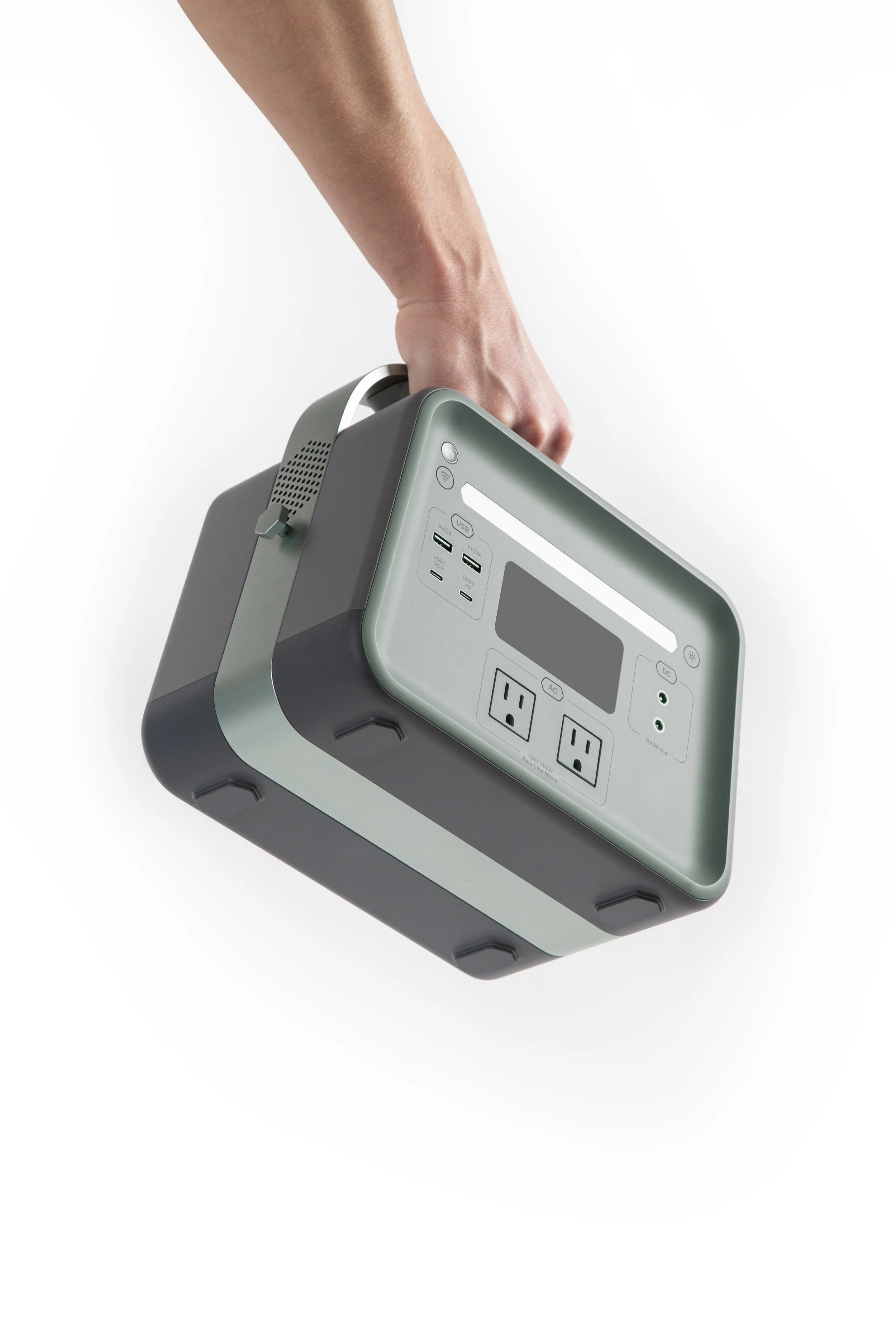
A crucial aspect of the design language was to ensure it was easily scalable to various sizes of portable batteries. The metal band treatment serves as a distinctive and functional design element that can be applied across all sizes and has the potential to evolve toward different product offerings in the future. The recessed input/output faces help protect the user interface and ports. The angled sides help communicate stability and durability.
We and our brand team collaborated closely to establish Yoshino's design language, conveying its technological innovation and reliability both now and in the future. The logo, consisting of hexagons arranged to form a unique bee icon, represents the brand's commitment to sustainability and the powerful energy output of Yoshino's batteries.
We made sure that there was clear fusion between the Industrial Design details on the product and the brand.
Creating a distinctive design language was paramount in shaping the product from form and color scheme to exterior materiality. In our pursuit of recognizable form language, we evaluated various ideas to ensure the final product is compact, durable, easily storable, ergonomic, and well-balanced in weight distribution.
We concentrated our effort on harmonizing Industrial Design, Graphic Design and also UI Design.
All images © Yoshino and Fuseproject
www.fuseproject.com
www.yoshinopower.com